As schools increasingly recognize the importance of a strong online presence, the choice between responsive and adaptive web design becomes a pivotal decision. Both approaches aim to provide a seamless user experience across various devices, but they differ in their methods and outcomes. In this blog post, we'll explore the nuances of responsive and adaptive design, helping educational institutions make an informed decision when revamping their websites.
Understanding Responsive Design
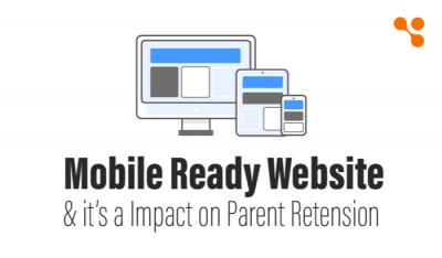
Responsive web design entails creating a single website that automatically adjusts its layout and content to fit different screen sizes. This approach relies on flexible grids and media queries to adapt to various devices, ensuring a consistent and user-friendly experience across desktops, tablets and smartphones.
Pros of Responsive Design for Schools:
a) Unified Design - Maintain a consistent look and feel across all devices, presenting a cohesive brand image.
b) Cost-Effective - Develop and maintain a single website, reducing costs compared to managing multiple versions.
c) Future-Proof - Adapt to new devices and screen sizes without the need for significant redesigns.
Understanding Adaptive Design
Adaptive web design involves creating multiple versions of a website, each tailored to specific device categories. This approach uses server-side components to detect the user's device and deliver a customized layout optimized for that particular screen size.
Pros of Adaptive Design for Schools:
a) Targeted Optimization - Tailor content and design for specific devices, optimizing the user experience.
b) Performance Control - Optimize page load times by delivering only the necessary assets for a particular device.
c) Precision - Fine-tune designs for different screen sizes, ensuring an optimal presentation.
How to Make a Right Choice for your School Website?
a) Consider Audience and Devices - Analyze the primary devices used by your audience, such as students, parents, and faculty.
b) Evaluate Content Complexity - Assess the complexity of your website's content and determine whether responsive or adaptive design better accommodates your needs.
c) Budget and Resources - Consider your budget constraints and the availability of resources for ongoing maintenance and updates.